Maintaining visual cohesion strengthens brand recognition and promotes a professional image. A well-defined framework for color usage streamlines workflows for designers and developers, eliminating guesswork and ensuring accurate color reproduction across different media. Such clarity can improve efficiency and reduce the risk of inconsistencies that could detract from brand identity.
This foundation in color management paves the way for exploring more nuanced topics related to accessibility, cultural significance of color, and the psychology of color in branding. It is a crucial first step in developing a robust and effective visual strategy.
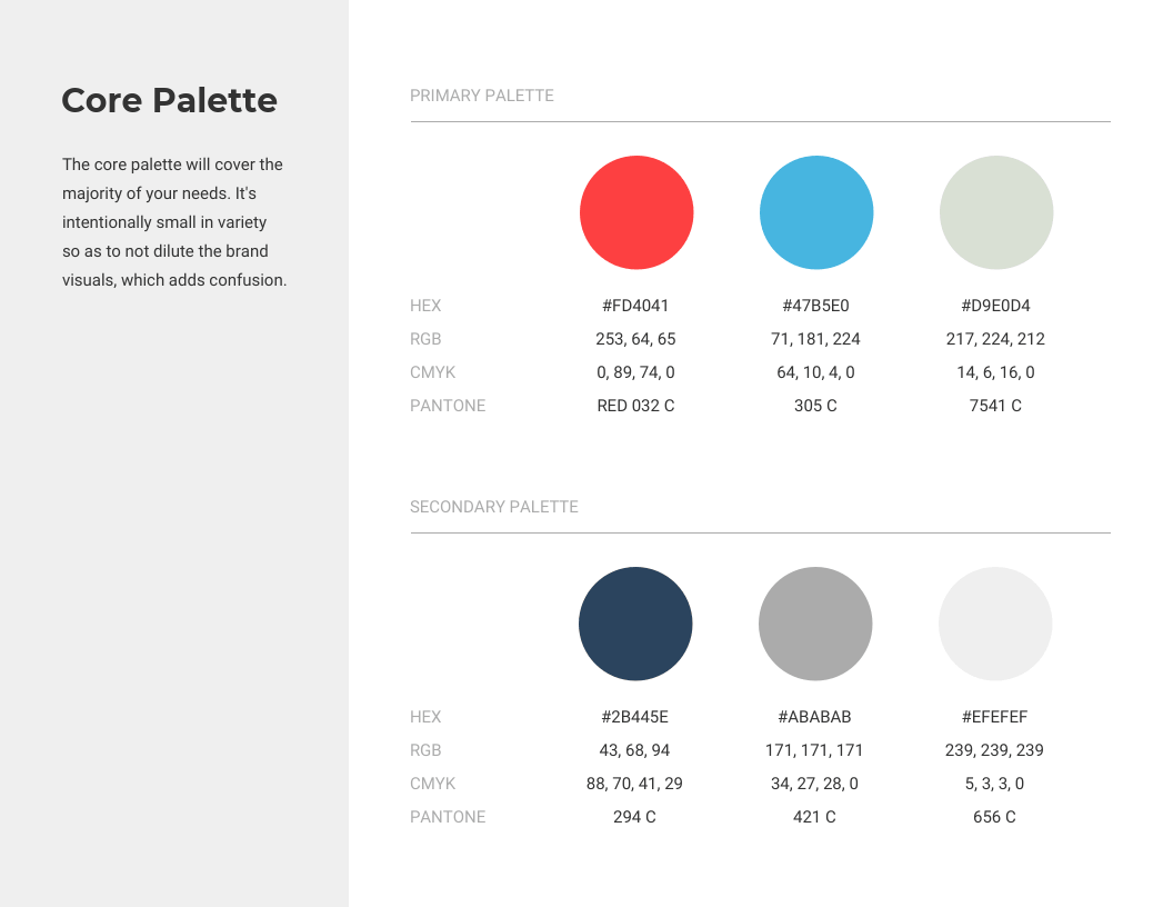
Key Components of a Color Style Guide
Effective color management relies on a structured approach. A comprehensive style guide includes several key components that ensure clarity and consistency.
1. Color Palette: The core element comprises the specific hues chosen to represent the brand. Each color should have a designated name and clearly defined usage.
2. Color Values: Numerical representations of each color are essential for accurate reproduction. These typically include hexadecimal codes, RGB values, and potentially CMYK values for print applications.
3. Usage Guidelines: Clear instructions on how and when to use each color prevent ambiguity. This section might detail primary, secondary, and accent color usage, along with specific applications for background, text, and interactive elements.
4. Accessibility Considerations: Addressing color contrast for users with visual impairments is crucial. The guide should specify minimum contrast ratios for text and background combinations to ensure readability.
5. Logo Variations: If the logo exists in multiple color variations (e.g., light and dark backgrounds), these should be clearly documented to maintain visual consistency across different contexts.
6. Example Applications: Visual examples demonstrating the color palette in practical scenarios, such as website mockups or marketing materials, can provide valuable context and guidance.
7. Version Control: Tracking changes and updates to the guide ensures that all stakeholders have access to the most current information. This is particularly important for larger organizations or projects with evolving brand identities.
A well-structured guide with these components facilitates consistent brand representation across all platforms and materials, strengthening brand identity and improving communication effectiveness.
How to Create a Color Style Guide
Developing a robust color style guide requires a systematic approach. The following steps outline a process for creating a comprehensive and effective guide.
1: Define Brand Personality: Begin by clearly articulating the brand’s personality, values, and target audience. This understanding informs color choices that resonate with the intended message and evoke the desired emotional response.
2: Select a Core Palette: Choose a limited set of primary colors that represent the brand’s essence. Consider color psychology and cultural associations to ensure the chosen hues align with the brand’s identity.
3: Determine Color Values: Specify precise color values for each selected hue using hexadecimal codes, RGB values, and CMYK values for print materials. This ensures accurate and consistent color reproduction across different platforms and media.
4: Establish Usage Guidelines: Develop clear rules for how each color should be used. Define primary, secondary, and accent colors, and specify their application in various contexts, such as backgrounds, text, and interactive elements.
5: Address Accessibility: Ensure sufficient color contrast between text and background elements to meet accessibility standards. Specify minimum contrast ratios for different color combinations to ensure readability for users with visual impairments.
6: Develop Logo Variations: If applicable, create and document logo variations for different background colors (e.g., light and dark versions) to maintain visual consistency and brand recognition.
7: Create Visual Examples: Include visual examples of the color palette in practical applications, such as website mockups or marketing materials. These examples provide clear guidance and demonstrate the intended usage of the color scheme.
8: Document and Maintain: Compile all the above elements into a formal document or digital resource. Establish a system for version control to track updates and ensure all stakeholders access the most current guidelines. Regularly review and update the guide as the brand evolves.
A well-defined color style guide fosters brand consistency, streamlines workflows, and enhances communication effectiveness. This structured approach to color management contributes significantly to a cohesive and impactful brand presence.
A formalized system for managing color palettes provides a crucial foundation for consistent branding and effective visual communication. Precise color definitions, clear usage guidelines, and accessibility considerations ensure that brand identity remains cohesive across all platforms and materials. Such a system streamlines workflows for design and development teams, reducing ambiguity and promoting efficiency.
Investing in the development and maintenance of a comprehensive framework for color usage constitutes a proactive step towards building a strong and recognizable brand presence. This investment yields substantial returns in terms of improved communication, enhanced user experience, and a cohesive brand identity that resonates with the target audience. Consistent application of these principles strengthens brand recognition and reinforces professional credibility in the marketplace.
